Introduction
This article provides a brief description of the dashboard.
- The dashboard is the main page on your screen after you log in to your Skeduler account.
1 Understanding the main menu
The main menu runs across the top of the page. The main menu has two sections.
- On the left side of the menu, you can see seven menu buttons. Click a button to open a Skeduler tool.

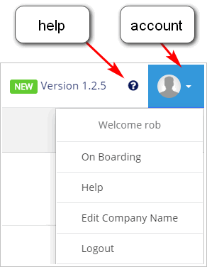
- On the right side of the menu, you can see the current version of the software plus the Help button and Account information button.
2 Reviewing information sections
Scroll down the page and you can see six sections. Each section summarises a different set of business data. These tables, graphs, and charts display data that has been entered into the system by your staff.
2.1 Dashboard information and statistics
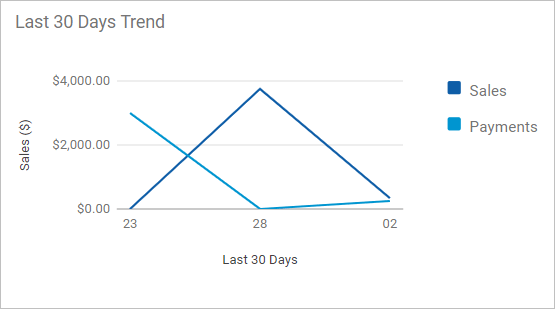
This section gives you a snapshot of sales and revenue. These data include:
- actual revenue vs targets based on key performance indicator assumptions
- sales trends for 30 days and 12 months
For more information about key performance indicators, see:
2.2 Sales revenue
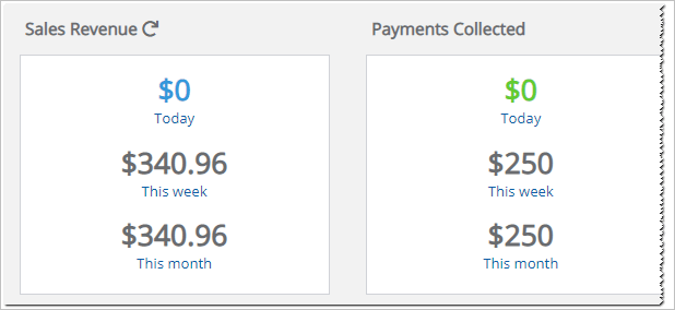
Sales data are summarised here. These data include:
- sales, payments, and credits
- new clients, job bookings, and calls
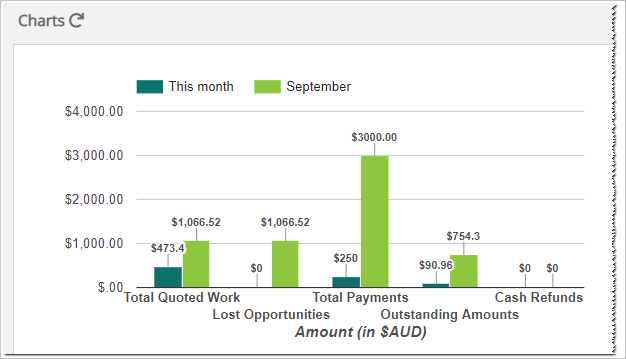
2.3 Charts
The Charts section presents sales and business performance data in graphics and tables. For more information, see:
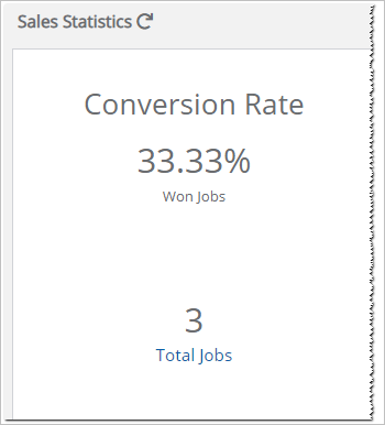
2.4 Sales statistics
These data tell you about job conversion rates by comparing the number of quotes to converted sales. For more information, see:
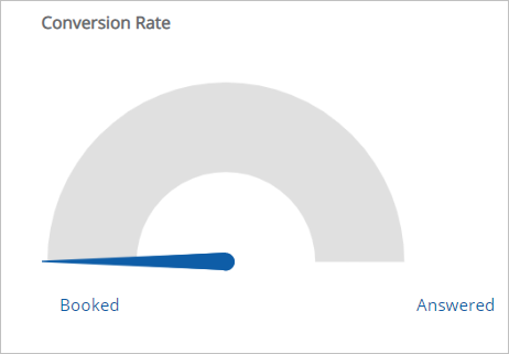
2.5 Call statistics
These data summarise call information collected by a third-party service provider like Avanser. To generate and display information in this section, you need to integrate that service with Skeduler.
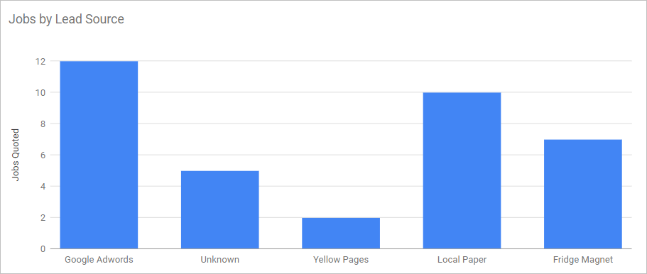
2.6 Marketing performance
These data summarise new jobs and sales by leads source. For more information, see:
